Why football logos keep getting simpler
Football logos used to love detail. Extra outlines. More colours. More shading. More literal mascots. The old thinking was simple enough: if the badge looked richer, it felt stronger. But a lot of teams have moved in the opposite direction over the last decade.
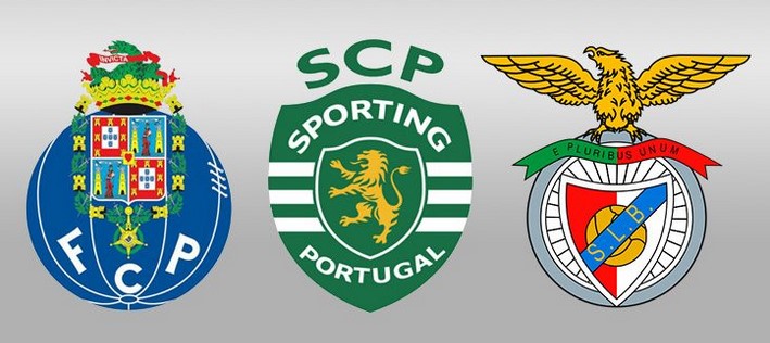
However, if you walk through Lisbon or Porto, you’ll see that the heart of these clubs hasn't changed. Whether it’s the eagle perched atop Benfica’s red, or Porto’s iconic blue stripes, these logos still hit the same. They’ve managed to do the impossible: simplify for a modern world without losing the decades of history stitched into every jersey. They have stripped things back, reduced clutter, sharpened shapes, and trusted simpler marks to carry more of the identity.
That is not an accident. It is a response to how sports are seen now. A logo no longer lives mainly on a stitched crest, a stadium wall, or the front page of a programme. It lives on phone screens, streaming sites like DAZN Portugal, score bugs, social tiles, fantasy dashboards, and all sorts of digital touchpoints. Even in the specialized UI of sports-integrated platforms like xtp.com, the visual language must be 'coded' so efficiently that the user identifies the team in a fraction of a second.
Recognition matters more than detail
That is really the heart of the issue. A sports logo does not usually get a long, careful look. Most of the time it gets a glance. Maybe half a second. Maybe less. It appears in motion, in a tiny corner of the screen, on a shirt from thirty rows back, or in a social feed where the user is already scrolling past three other things. In those conditions, detail is often not a strength. It is noise.
Simple logos survive that pressure better. They are easier to remember, easier to reproduce, and easier to identify from a distance. Strong branding comes from clarity, not from stuffing more ideas into the mark. That is why minimalist football logos tend to feel stronger in modern use, even when older fans sometimes miss the extra ornament. There is a good lesson in that. Sports identity is emotional, but it still has to function. The best logos are the ones that keep their meaning even when they shrink.
Digital-first branding changed the rules
A lot of this comes down to the simple fact that sports branding is now digital-first. That does not mean clubs have stopped caring about stadiums, shirts, or signage. It means the design process now has to begin with the question: how will this look on every screen? Teams have been adapting to this for years.
That logic applies to logos too. A modern crest has to work in app icons, livestream graphics, mobile notifications, fantasy sports interfaces, sponsor placements, and short-form social media clips. It has to hold together in motion and in miniature. That pushes teams toward cleaner typography, bolder shapes, fewer unnecessary elements, and stronger colour discipline. What gets lost in decoration is often gained in flexibility.
Sports branding now lives beyond the stadium
This is what makes the current era different. Branding does not stop at the ground anymore. Fans now encounter club identity in dozens of places between matches. A badge appears beside a transfer update, in a reel, on a fixture graphic, in a reaction clip, on a podcast thumbnail, or in a fan-made lineup post. The logo becomes part of the daily flow of football culture, not just the formal matchday world.
That has changed the role of visual identity. A logo no longer only represents the team. It has to carry the team through a constant stream of media. It has to feel familiar and trustworthy in all those places. Minimalism helps because it travels well. A clean mark adapts more easily to the speed and repetition of digital life. This is also why some redesigns that initially feel too simple make more sense after a year or two. They were not really built for one big reveal. They were built for constant use.
Why simplicity builds loyalty
There is also something emotional going on here. Fans respond strongly to visual consistency. A clean, stable logo builds recognition over time because it does not fight itself. It becomes easier to attach memory to it. The more often supporters see it in different contexts, the more it settles into their sense of the club’s identity.
That is one reason simpler marks can end up feeling more powerful than complicated ones. They are easier to carry. Easier to sketch. Easier to remember. Easier to love. The famous football logos that really last tend to have that quality. They look obvious only after years of repetition have made them part of the furniture. Fans put it well when they said a new logo is never just a new logo. It becomes part of something bigger around the team and its future identity.
The strongest identities are often the simplest
None of this means every team should flatten its history into a plain shape and call it progress. Some clubs lose something important when they simplify too carelessly. Heritage still matters. Character still matters. Tradition still matters.
But the wider direction is clear. Modern sports branding rewards clarity. It rewards marks that can survive every screen, every crop, every fast-moving digital context. Less detail often means more recognition, more trust, and more staying power.
That is why less is more now. Not because sports have become less emotional, but because the emotional life of sport now happens in more places than ever. And the logos that endure are the ones built to live everywhere.